

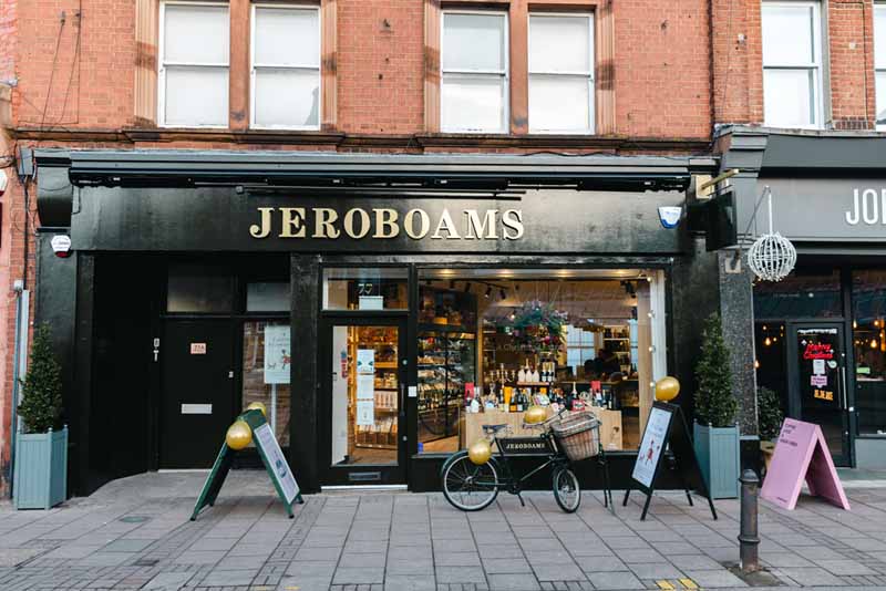
For over thirty years, Jeroboams have been at the heart of some of London’s oldest neighbourhoods; offering a wealth of experience in fine wines, as well as beers, spirits, charcuterie and cheeses. Just last month, Impact Retail designed and implemented a beautiful retail identity for the Jeroboams Wimbledon store.
Launching mid-December, the revamped store kicked off the festive season but the brand have big plans for the years ahead including innovative wine tasting and insight into investment, brokering and storage, all of which can take place during a visit to the store itself.
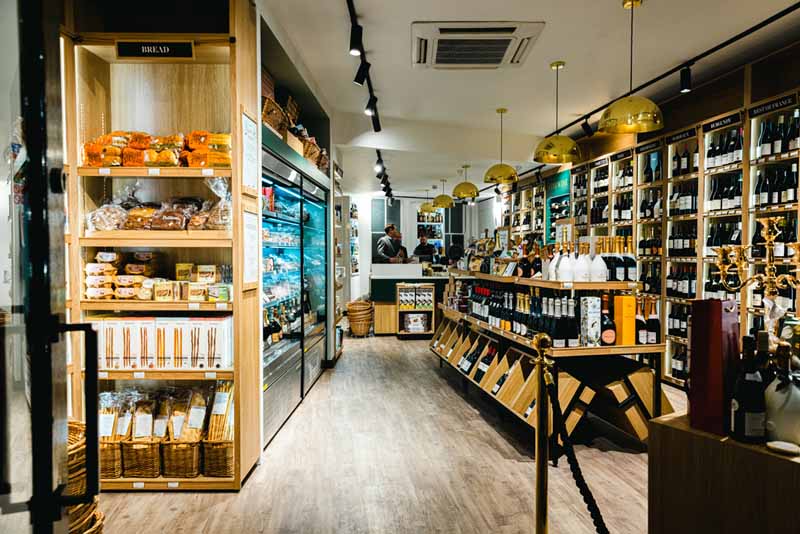

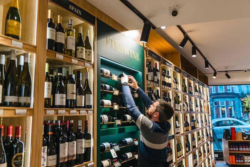
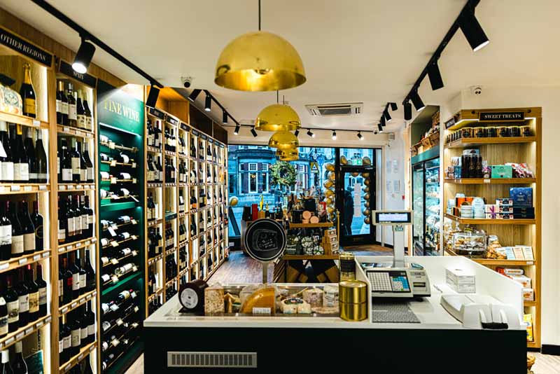
The overarching objective for Jeroboams Wimbledon was for customers to explore the store more extensively and feel entirely comfortable in the surroundings, regardless of feeling like a wine novice or an experienced connoisseur. Impact Retail crafted a retail strategy which would elevate how the Jeroboams store connected with the customer, from the graphic communication through to locations for informal chats with the Jeroboams ambassadors.
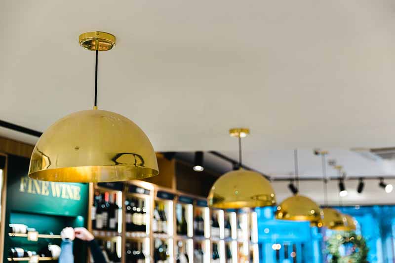
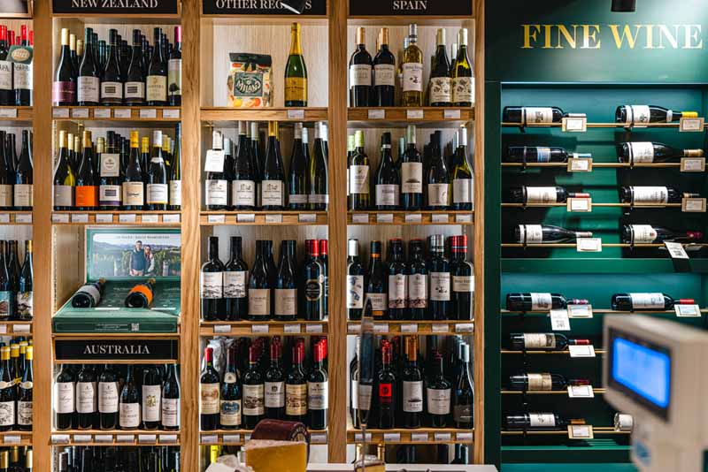
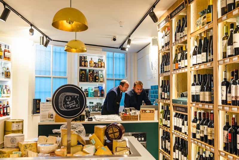
The interior is a sleek mix of real oak, black metalwork, rich green tones and elegant gold finishes. Delving deeper into the space, shoppers can source wines based on their tasting notes or desirable food pairings, with the graphic communication also designed by the team at Impact. A clearly marked emerald-green bay details the fine wine selection, showcasing these products with style.
Sustainability also played a huge role in the development of the store, removing the classic use of plastic shelf strips and replacing them with beautifully crafted oak fronts for the units and high-quality paper inserts for the graphics.
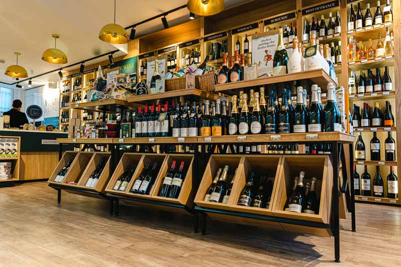
With north of 600 wines available alongside a wide range of food, all displayed in a relatively modest space, opening a new wine shop always represents a healthy challenge. Working with Impact provided an exciting step change in how we approach a project like this as it allowed us to really hone in on the types of customer who come to the shop and the different entry points to our range. Once we had this in place we turned our attention to providing a retail solution that was both flexible, allowing us to build on our learnings and try new things, whilst also maintaining the high quality finish that Jeroboams are known for. I’m incredibly happy with the results and believe with these strong foundations in place we have raised the bar in terms of the in-store customer experience Jeroboams can offer. Matt Tipping, Jeroboams, CEO
Key to the design choices was the acknowledgement of multiple Jeroboams stores. Green, black and gold with the use of premium timber will become the recognisable material palette for Jeroboams across each store; creating consistency for shoppers who may visit multiple locations across the capital.
The identity of the retail space not only elevates the Jeroboams voice, but also promotes a more comfortable and adventurous peruse of the wine selection. The first of many store designs for Jeroboams, from the Impact Retail Team.